project 1
COLOR AS MEDIUM
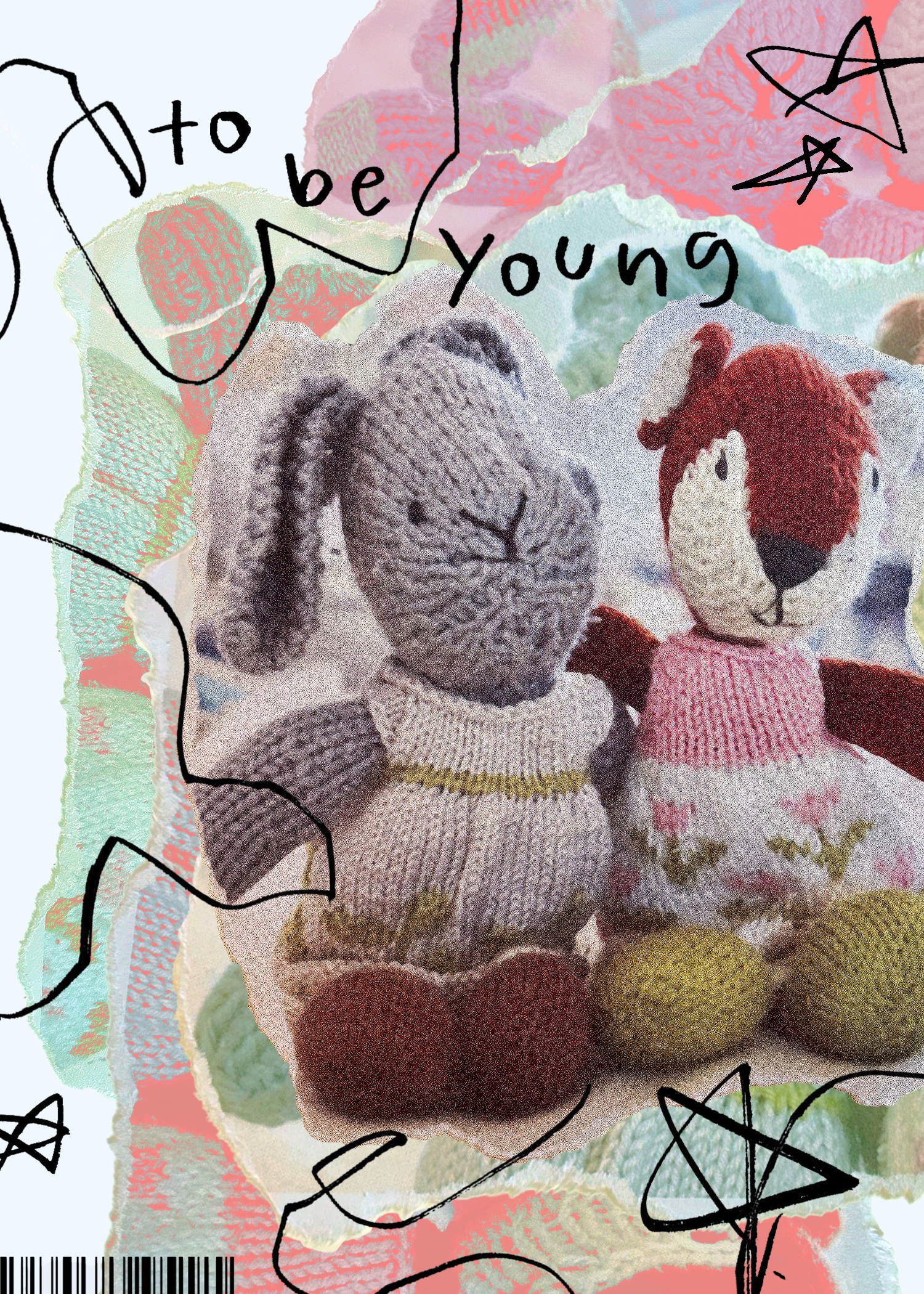
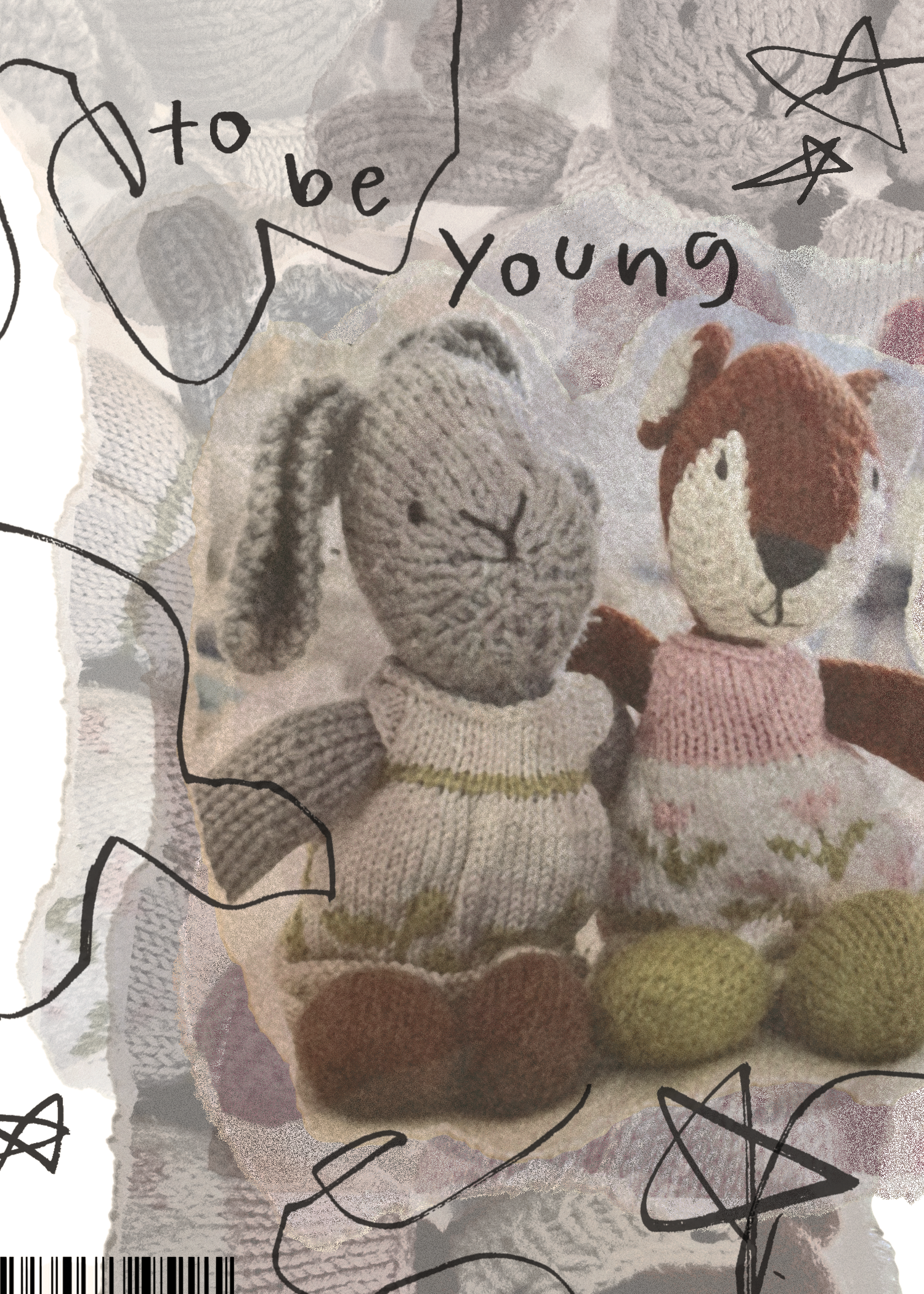

IN THIS WORK: My aim was to use color as the main medium in portraying the two sides of youth. The image on the far left is composed using RGB color, while the version in the middle is composed using CMYK color (the image on the far right is the physical print of the CMYK version). The first image utilizes the vibrancy allowed by the RGB color system to showcase the joyful and fresh feeling of being young, while the second image utilizes the more muted colors of the CMYK system to illustrate a more nuanced and weary view of the world from an older lens. Colors peek through the greyed-out image very faintly, offering a glance into the past and conveying a sober effect entirely different from the vibrant version. Additionally, I crumpled, smoothed out, and ripped the edges of the physical print in order to give it an even more aged appearance.
PROCESSES
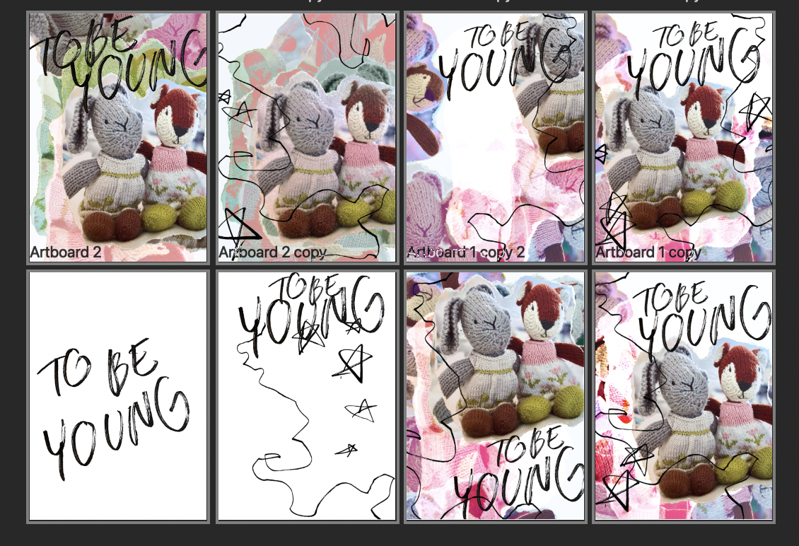
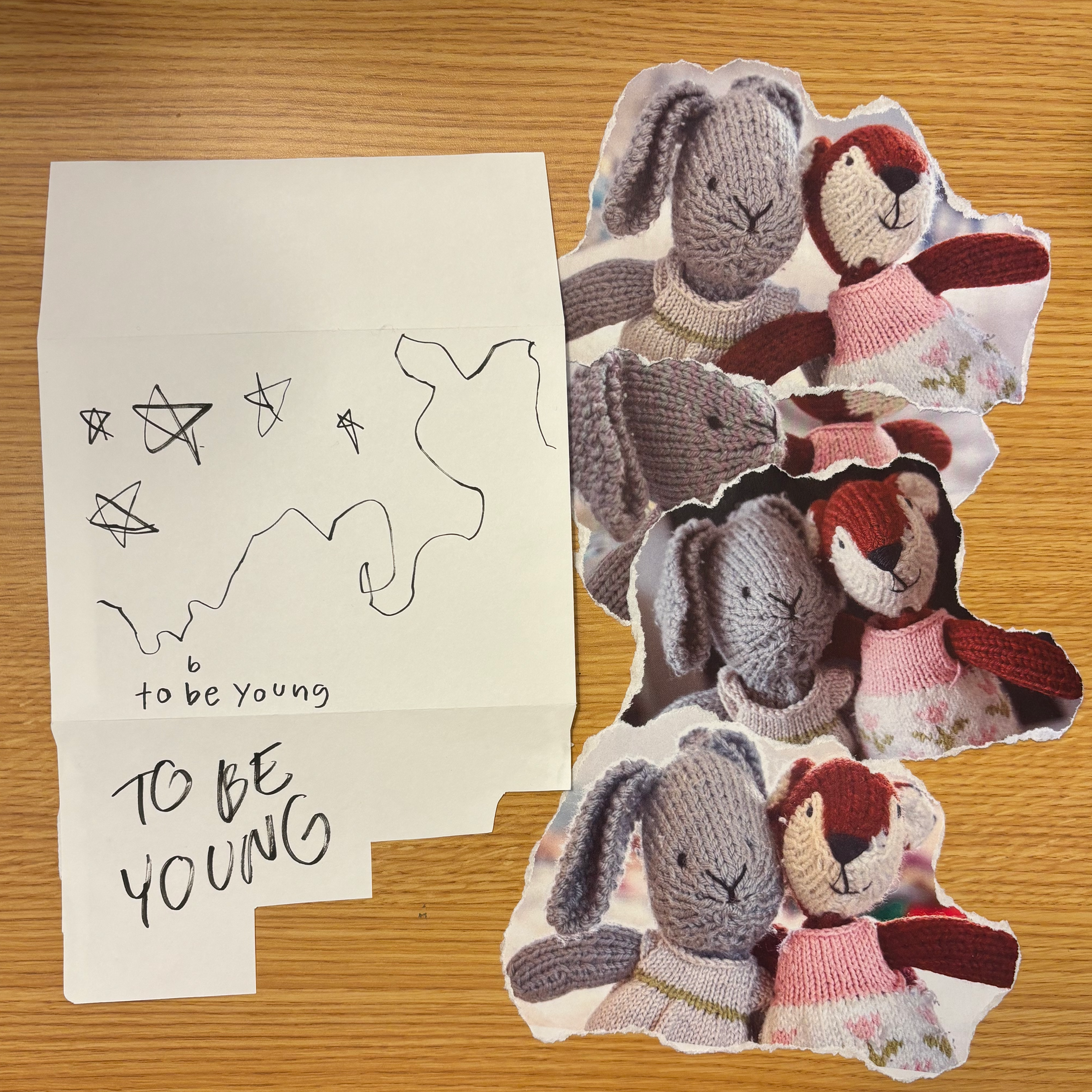
1. Drafts I created in Photoshop while I was experimenting with different fonts and blend modes for each piece of my digital collage. I used vivid and pin light blends for the brighter and more multicolored versions in the second row but ultimately decided to stick with primarily soft light and screen blends in order to create a more gentle feeling. 2. Writing and doodles I drew and scanned into Photoshop - creating these by hand made my piece feel more organic and whimsical. I tried two different fonts but decided to use the lowercase one, as it reminded me of a child's handwriting and leaned into the overall mood of my piece more. Additionally, I printed out photos of my stuffed animals and ripped the edges before scanning them into Photoshop and editing them to recreate the organic collage effect.